

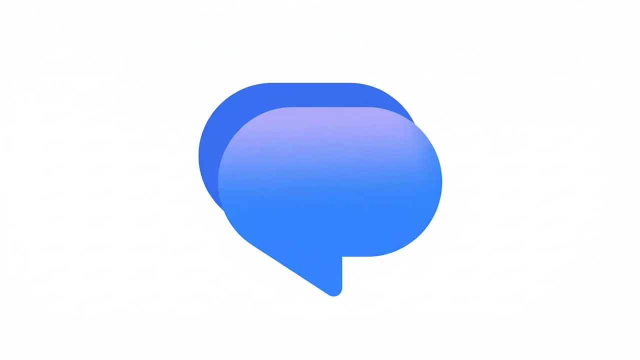
Google Messages has begun rolling out a redesigned app icon featuring a rounded speech bubble and blue gradient, replacing the previous flat pill design. The update, identified in the v20261030 beta version, marks the latest step in Google's broader initiative to refresh its app icons across the ecosystem.
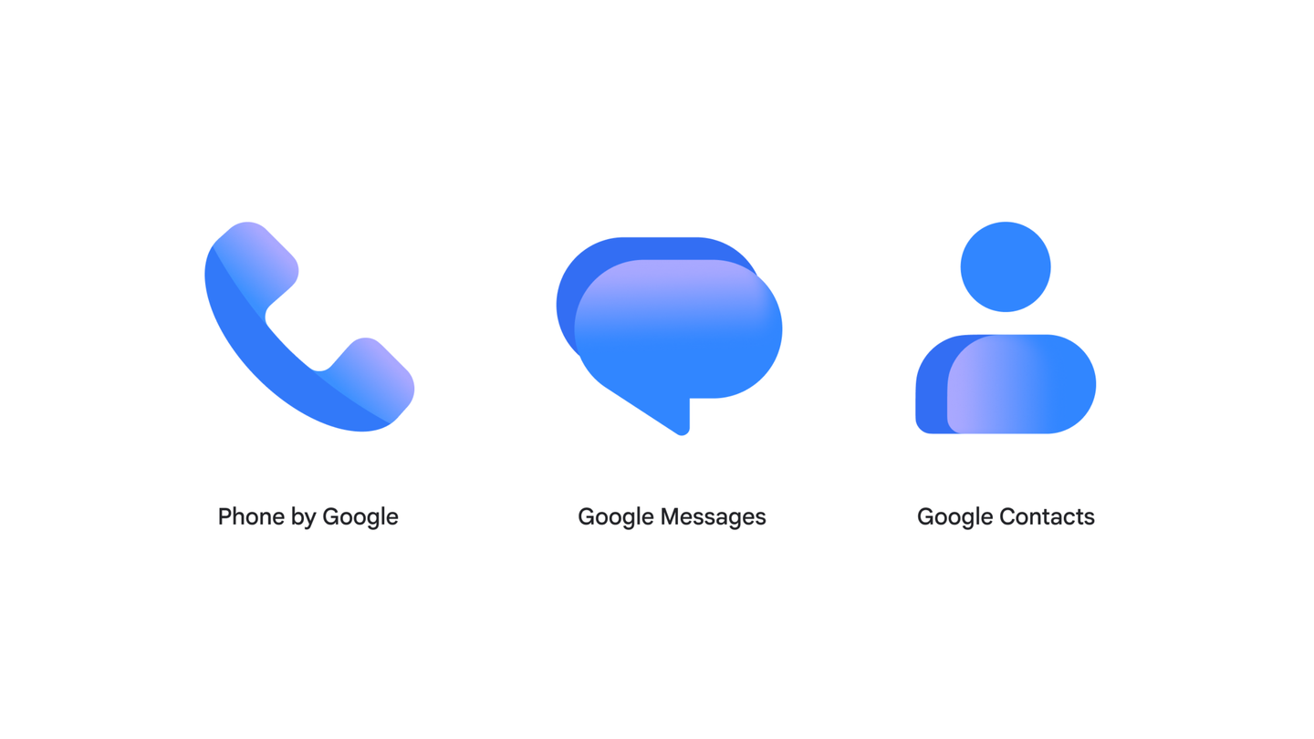
The new icon maintains the familiar overlapping double-speech-bubble concept that has long characterized the messaging app, but introduces a smooth gradient blending from a softer pinkish-blue highlight across the top edge down into a vibrant royal blue. A darker solid blue bubble appears tucked behind the foreground bubble to the upper-left, carrying over some inspiration from the previous design.
Google stated that the icons are "sharper and clearer" on homescreens thanks to a "subtle but crisp gradient with easily readable edges." The redesign also features updated curvature to align with the rest of the Google apps users know and love. The company emphasized that there are no functional changes with this update - it represents a visual refresh only.
The updated icon appeared first in the Google Messages v20261030 beta and subsequently began rolling out to the stable channel. The redesign is part of a wider trend of Google updating its app icons, having previously refreshed icons for Workspace apps, Contacts, Phone, and other applications. The icon change also extends to Wear OS versions of Google Messages.
For users, the change means a sleeker, more cohesive look on home screens without any alteration to the app's functionality. The new design will presumably make its way to all users in the coming weeks, though Google has not confirmed a specific stable rollout timeline.